Sports Interactive has released the first "deep dive" into the features of Football Manager 27, this time focused on the interface and user experience. In the video, associate game director Rémy Boicherot and senior feature manager Ant Farley explain the main changes, which promise to make getting around the game clearer, faster and more customisable. The idea is simple: fewer clicks and less time lost in menus, so that managers can focus on what really matters, shaping their story and exploring the world of football.
Primary and secondary navigation at the top of the screen
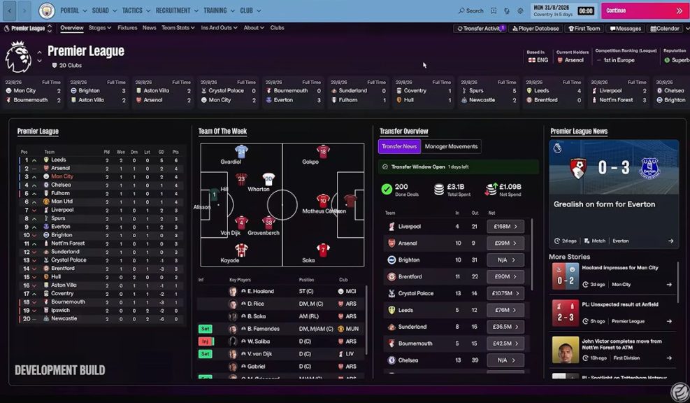 All navigation is now concentrated in two menus at the top of the screen: a primary menu with the main sections, and a secondary menu with clubs, leagues and the rest of the football world. This reorganisation made it possible to rethink how screens are put together, putting the quality and relevance of the information first. Tiles are still there, but they are no longer essential for getting around. Another important change is that several windows and pop-ups have become full screens, so you always know where you are and what comes next, without constantly closing windows.
The main sections get straight to the point
The core areas of the game, squad, tactics, recruitment, training and club, have been updated to better reflect a manager's real responsibilities. For example, when you open the squad section you immediately see the full squad, and when you open tactics or training, you go straight to those areas with no extra steps. Each of these main sections now has a control panel at the top that brings together the key decisions for that area: team meetings, budget adjustments, advice from the coaching staff or delegating responsibilities. Everything is easier to reach and quicker to manage.
Redesigned messages with information right where you need it
The in-game messages have also been rethought. They now use colour coding so you can quickly spot what matters most, and the relevant information appears directly in the message itself. A good example is the scout report: when you click a message about a scouted player, the full report is already included, with no need to open another tab. The same goes for transfer offers, which can now be handled straight from the message. The images released by Sports Interactive show that a single message can bring together scout reports and several transfer offers, giving you the full picture with fewer items in your inbox.
An interface that adapts to your screen
For FM27, the interface logic has been reworked to recognise the player's preferences and adapt to any screen size and resolution, whether on a laptop or a 4K monitor. This is possible thanks to a new scaling mode that you control in Preferences, which lets you choose between the default level of information and two more options: one to show more data on screen and another with larger, easier to read elements. Tables, seen as the heart of FM, have been optimised to show as many rows as possible without vertical scrolling, and as many relevant columns as possible horizontally, and they can always be combined with custom views.
The images shared by Sports Interactive give a better look at this preferences screen. The three scaling modes are called Default (the standard option), Scaled and Condensed. Just below there is an option to pick a custom skin colour, chosen from a palette, plus a group of interface transitions that lets you turn the animations for menus, reports and cards on or off.
More customisation: tiles, bookmarks and shortcuts
FM27 also introduces what it calls tile swapping, which lets you replace some of the tiles shown on the portal and other screens with others of the same size, using dropdown menus. This feature is also coming to the match interface (Match UI), as will be explained in more detail in the deep dive on the Match Engine.
The bookmarks bar now has text descriptions and lets you reorder bookmarks by dragging them, which makes it easier to tailor to the different stages of the season.
In Preferences you can also remap keyboard shortcuts and choose where you are taken when you click each option in the main menu. For example, you can choose for squad or recruitment to open directly in a specific area instead of always going to the overview.
An evolution of FM26, shaped by player feedback
According to the Sports Interactive team, FM27 builds on the visual language introduced in FM26 while bringing back navigation elements and behaviours from earlier games in the series. In short, it is a direct response to the criticism the community made of the FM26 interface. The goal remains the same: fewer clicks, more game, more relevant information on each screen and more ways to customise the experience. This is only the first of several deep dives on FM27. The next one will focus on new, improved and returning elements that make the game deeper and more immersive. Sports Interactive published more details in a dedicated article (FM27.info/UIBlog) and has already answered community questions in a Reddit AMA: read everything SI revealed in the AMA here.